
Designing a dashboard is not the same as designing a landing page, a poster, or a brand identity. A dashboard is a working environment. Users come to it to understand performance, detect risk, compare metrics, make decisions, and often act under time pressure. In that context, color is not decoration. It is a cognitive tool.
The right color system can help users notice what matters, understand hierarchy, separate categories, and interpret data quickly. The wrong color system can create confusion, false urgency, accessibility problems, and decision fatigue. A beautiful dashboard can still fail if users cannot read it accurately.

Why Color Psychology Matters in Dashboards
Color affects attention before users consciously process content. A red number, a green upward trend, a muted gray label, or a bright warning badge can change how quickly someone reacts. This is useful, but also dangerous. If colors are used without discipline, users may misread importance or assume meaning where none exists.
Dashboards usually contain dense information: metrics, charts, filters, tables, status labels, alerts, comparisons, and time ranges. Color helps reduce this complexity when it is tied to a clear system.
Color can support dashboard usability by helping users:
- Identify urgent issues faster
- Separate categories and data series
- Understand positive, negative, and neutral states
- Follow visual hierarchy
- Compare values across charts
- Notice patterns over time
- Reduce scanning effort
- Avoid unnecessary cognitive load
The goal is not to use more color. The goal is to use color with meaning.
The Cognitive Load Problem
Cognitive load is the mental effort required to understand information. Dashboards are especially sensitive to cognitive load because users often need to interpret multiple data points at once. When every chart, card, and button competes for attention, the user has to work harder.
Color can either reduce or increase that load. A restrained palette helps users form expectations. A chaotic palette forces users to decode the interface repeatedly.
A dashboard increases cognitive load when it uses:
- Too many saturated colors
- Different colors for the same meaning
- Similar colors for different meanings
- Decorative gradients on data elements
- Low contrast text or labels
- Alarm colors for normal information
- Chart palettes that cannot be distinguished quickly

The best dashboard palettes are predictable. Once users learn the system, they should not need to think about what each color means every time.
Use Color to Create Hierarchy
Not everything on a dashboard deserves equal attention. A dashboard should guide the eye from high-level summary to important changes, then to deeper detail. Color is one of the strongest ways to create this hierarchy.
Primary colors should be reserved for the most important interactive or status elements. Secondary colors can support categories and comparisons. Neutral colors should carry most of the interface structure: backgrounds, borders, labels, grid lines, and inactive states.
A practical hierarchy might look like this:
- Neutral colors for layout and structure
- One primary color for key actions or selected states
- One accent color for highlights
- Semantic colors for status
- Chart colors for data series
- Muted colors for inactive or background information
This prevents the dashboard from becoming visually loud. When everything is bright, nothing feels important.
Semantic Color: Red, Green, Yellow and Their Risks
Most dashboards use semantic colors: green for success, red for danger, yellow for warning, blue for information, and gray for neutral states. This system is familiar, but it still needs care.
Red is powerful because it signals urgency or loss. Use it too often, and users become desensitized. Green often signals success or positive movement, but in financial or operational contexts, not every increase is good. For example, higher costs, higher churn, or higher error rates should not be green.
Semantic colors should be connected to meaning, not emotion alone.
Good semantic color rules include:
- Red only for true problems, danger, loss, or critical decline
- Yellow or amber for warning, attention, or incomplete status
- Green for confirmed success, healthy status, or desired improvement
- Blue for information, neutral guidance, or selected states
- Gray for inactive, unavailable, or secondary information
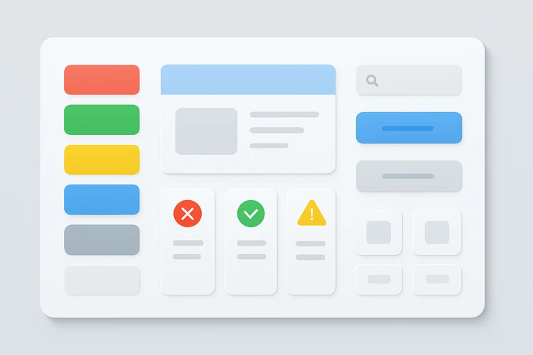
The most important rule is consistency. If red means “critical” in one module and “decline” in another, the user must stop and interpret each context manually.
Color in Data Visualization
Charts are where dashboard color choices become most visible. A chart palette must make comparisons clear without overwhelming the user. The designer should choose colors based on the type of data, the number of series, and the decision the user needs to make.
Different chart purposes require different color strategies.
For comparison charts:
- Use distinct colors for categories
- Avoid unnecessary gradients
- Limit the number of competing series
- Highlight the most important value
- Keep secondary values muted
For time-series charts:
- Use one strong color for the main metric
- Use muted comparison lines
- Avoid using too many similar line colors
- Make selected time periods obvious
- Use color changes only when they communicate meaning
For status dashboards:
- Use semantic colors sparingly
- Pair color with labels or icons
- Make critical states visually obvious
- Avoid using red for minor variation
A chart should answer the user’s question faster than a table, not become a puzzle.
Accessibility and Color Blindness
A dashboard that depends only on color will fail for many users. Color blindness, low vision, poor contrast, bad screens, bright environments, and fatigue can all affect readability. Accessibility is not a separate design layer. It is part of making a dashboard usable.
Never use color as the only signal. Pair it with labels, icons, patterns, shapes, text, or position. A red dot and a green dot may look different to some users but not to others. A label such as “Critical” or “Healthy” removes uncertainty.
Accessible dashboard design should include:
- Strong contrast between text and background
- Labels for status colors
- Icons or shapes to support color states
- Patterns or line styles for complex charts
- Avoidance of red-green-only comparisons
- Clear focus states for keyboard navigation
- Testing in grayscale or color-blindness simulators

The test is simple: if the dashboard becomes confusing in grayscale, the color system is doing too much work.
Designing for Emotion Without Manipulation
Dashboards are not emotionless. A sales dashboard, health dashboard, financial dashboard, or security dashboard can create pressure. Color can amplify that pressure. A designer should be careful not to exaggerate urgency or create anxiety through unnecessary warning colors.
A calm dashboard is often more useful than a dramatic one. Users should be able to understand problems without feeling overwhelmed. This is especially true for executive dashboards, operations dashboards, and healthcare or finance tools where decisions may carry serious consequences.
Good emotional design uses:
- Calm neutral backgrounds
- Clear warnings only where needed
- Reduced visual noise
- Predictable status colors
- Enough whitespace
- Highlighting that supports action
- Avoidance of alarm fatigue
Color should help users act responsibly. It should not trick them into panic or false confidence.
Building a Scalable Dashboard Palette
A scalable dashboard palette is more than a set of attractive colors. It is a system that can handle new charts, modules, metrics, and states without becoming inconsistent. This matters for SaaS products, enterprise tools, internal analytics platforms, and client reporting dashboards.
A scalable palette should include:
- Neutral scale for backgrounds, borders, labels, and dividers
- Primary brand color for interaction
- Accent color for focus or highlights
- Semantic colors for status
- Data visualization palette for charts
- Muted variants for secondary information
- Dark mode or high-contrast variants if needed
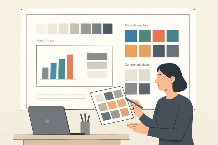
Document the rules. Do not only list colors. Explain when each color should be used and when it should not.
Final Thoughts
Color in dashboard design is a usability decision before it is an aesthetic decision. It shapes attention, meaning, hierarchy, emotion, and accessibility. A strong color system helps users understand complex data faster. A weak one adds confusion and visual noise.
The best dashboard palettes are restrained, consistent, accessible, and tied to real information architecture. They do not decorate the data. They clarify it. For UI/UX designers, mastering dashboard color means understanding both visual design and human cognition. When those two disciplines work together, dashboards become not just beautiful, but genuinely useful.