
A beautiful design mockup is only the middle of a digital product project. The real test begins when the design moves from concept to development. If the handoff is unclear, developers waste time interpreting files, asking repeated questions, guessing spacing, extracting colors, rebuilding components, and fixing details that should have been documented. The result is delays, frustration, and a final product that does not match the approved design.
A strong design handoff turns visual intent into buildable instructions. It does not mean designers need to write production code, but they do need to prepare files in a way that developers can understand and implement. Good handoff is a collaboration system, not a file export.

Why Handoff Fails
Handoff usually fails when the design file looks polished but is internally messy. Layers are unnamed, components are inconsistent, spacing is manual, colors are not documented, and edge cases are missing. The developer can see the surface, but not the system behind it.
Another common problem is late communication. Designers work in isolation until the final presentation, then expect developers to build everything exactly as shown. Developers may then discover that certain interactions are difficult, responsive behavior is unclear, or components do not match the technical framework.
Handoff problems often include:
- Unnamed or disorganized layers
- Inconsistent spacing
- Missing hover, error, loading, or empty states
- Unclear responsive behavior
- No design tokens or CSS variables
- Typography not documented
- Colors copied manually from different places
- Assets exported in the wrong format
- No explanation of interaction logic
- No communication before final approval
The solution is to prepare the design as a system from the beginning.
Use Naming Conventions
Naming conventions are one of the simplest ways to improve handoff. Developers should not need to open a design file full of layers named “Rectangle 482” or “Group 91.” Clear names help everyone understand structure quickly.
Good naming applies to pages, frames, components, variants, layers, icons, and exported assets. The naming system does not need to be complicated. It needs to be consistent.
Useful naming examples include:
- Page: Marketing Website
- Frame: Homepage / Desktop
- Frame: Pricing / Mobile
- Component: Button / Primary / Default
- Component: Button / Primary / Hover
- Component: Card / Feature
- Asset: icon-arrow-right
- Asset: hero-dashboard-preview

A developer should be able to scan the file and understand what each major element does.
Organize Layers and Components
Layer organization is not only a matter of neatness. It affects how easily developers can inspect spacing, structure, and reusable patterns. If a design uses components, variants, auto-layout, and consistent grouping, the developer can see the logic behind the interface.
A strong design file should include:
- Separate pages for exploration and final designs
- Clear component library
- Consistent auto-layout where possible
- Reusable buttons, cards, forms, and navigation
- Organized variants for states
- Removed unused experiments from final pages
- Clear asset export settings
- Locked background or decorative layers when useful
Messy layers suggest that the design may also be inconsistent. Clean structure builds trust.
Create a Style Guide
A style guide is essential for handoff. It gives developers a single source of truth for colors, typography, spacing, buttons, forms, icons, and components. Without a style guide, developers must inspect values across different screens and guess which ones are intentional.
A practical style guide should include:
- Color palette
- Typography scale
- Spacing system
- Grid rules
- Button styles
- Form fields
- Icons
- Cards and containers
- Alerts and status states
- Breakpoints
- Component behavior
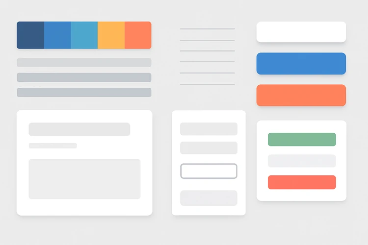
A style guide does not need to be huge. It needs to be accurate and complete enough for the current project.
Document CSS Variables and Design Tokens
For web projects, design tokens and CSS variables make handoff much smoother. Instead of telling developers to use “that blue from the button,” define a token such as –color-primary. Instead of using random spacing values, define a spacing scale.
Design tokens translate visual decisions into reusable implementation values.
Useful token categories include:
- Colors
- Typography
- Font weights
- Line heights
- Spacing
- Border radius
- Shadows
- Breakpoints
- Z-index levels
- Animation durations
Example naming logic:
- –color-primary
- –color-background
- –color-text-muted
- –space-4
- –radius-md
- –font-size-lg
- –shadow-card
Tokens reduce inconsistency and make future updates easier.
Typography Scales
Typography often breaks during development when sizes, line heights, weights, and responsive behavior are not documented. A design may look good in a mockup but become inconsistent across real pages if typography is treated screen by screen.
A typography scale should define:
- Font family
- Font weight
- Font size
- Line height
- Letter spacing when needed
- Use case for each style
- Mobile adjustments
- Maximum line width for readability
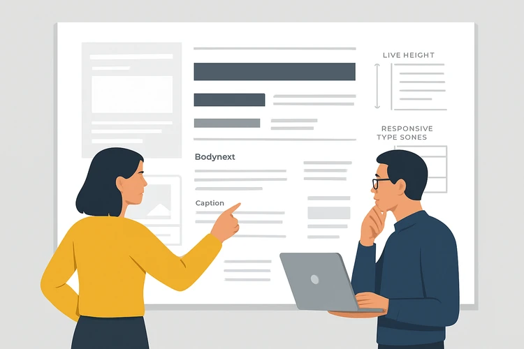
Typography should not be defined only by appearance. It should be connected to usage: H1, H2, body, small text, label, caption, navigation, button, and error message.
Responsive Behavior and Breakpoints
A desktop mockup is not enough. Developers need to know what happens on tablet, mobile, wide desktop, and unusual content lengths. If responsive behavior is not documented, developers must make assumptions.
Designers should prepare key responsive screens and rules:
- Desktop layout
- Tablet layout when needed
- Mobile layout
- Navigation behavior
- Stacking order
- Column changes
- Image cropping rules
- Content wrapping
- Minimum and maximum widths
- Sticky or fixed elements
The more complex the layout, the more important responsive documentation becomes.
States, Interactions and Edge Cases
A static design rarely tells the whole story. Developers need to know how components behave when users interact with them. Buttons have hover, active, disabled, loading, and focus states. Forms have empty, filled, error, success, and helper text states. Dashboards have loading, no data, and permission states.
Document states such as:
- Hover
- Active
- Focus
- Disabled
- Loading
- Error
- Success
- Empty
- Selected
- Expanded
- Collapsed
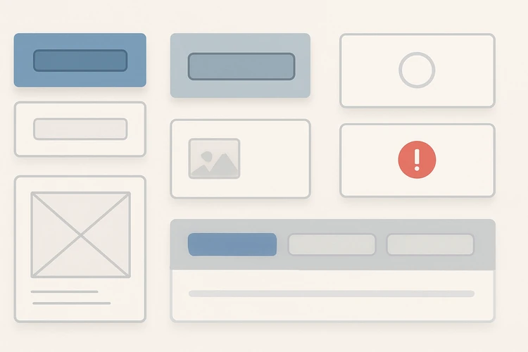
Edge cases often reveal whether a design is production-ready. What happens when a title is very long? What if a user has no data? What if an image fails to load? What if the price has more digits than expected?
Asset Export Rules
Exporting assets correctly saves development time. Designers should define which assets need SVG, PNG, JPG, WebP, or other formats. Icons should usually be vector. Photographic images may need optimized raster formats. Logos need correct variants. Decorative assets should be named clearly.
Asset handoff should include:
- Correct file names
- Correct formats
- 1x, 2x, or responsive sizes when needed
- Transparent backgrounds where required
- SVGs for icons and logos
- Optimized images
- Clear source versus final exports
- Licensing notes when relevant
Do not make developers hunt through the design file to guess which assets are final.
Collaborate Early With Developers
The best handoff happens before the final handoff. Designers should involve developers early, especially when a layout has complex interactions, animations, responsive behavior, or technical constraints. A short review before client approval can prevent expensive redesign later.
Good collaboration habits include:
- Developer review during wireframe stage
- Technical feasibility check before final approval
- Shared component naming
- Discussion of responsive rules
- Agreement on design tokens
- Clear issue tracking after handoff
- Open channel for questions during build
Handoff is not a one-time transfer. It is a working relationship.
Final Thoughts
A streamlined design handoff helps projects move from concept to development without confusion. It protects the quality of the final product and reduces unnecessary back-and-forth. Good handoff requires clean files, naming conventions, organized layers, style guides, CSS variables, typography scales, responsive rules, interaction states, and export documentation.
The best designers do not only create beautiful screens. They create buildable systems. When developers can understand the logic behind the design, the final product is more accurate, more consistent, and easier to maintain.