
Typography sets the tone of a brand before a single word is consciously read. A visitor may not understand the message yet, but they already feel whether the brand is premium, playful, technical, editorial, rebellious, minimal, traditional, or experimental. Type carries personality through shape, rhythm, scale, spacing, contrast, and motion. For modern brands, typography is no longer just a supporting design choice. It is often the main identity system.
In crowded digital markets, many companies are realizing that logos, color palettes, and stock visuals are not enough to stand out. A distinctive type system can make a brand recognizable across websites, apps, packaging, social posts, pitch decks, product interfaces, and print materials. The strongest brands do not simply choose a font that looks good. They build a typographic voice that matches their positioning and works across every customer touchpoint.
Why Typography Has Become a Brand Differentiator
Digital products have made many brand identities look similar. Clean sans-serif fonts, rounded buttons, minimal layouts, pastel gradients, and abstract illustrations became common across SaaS, fintech, wellness, e-commerce, and media brands. These systems are functional, but they can also become forgettable. Typography is one of the fastest ways to break that sameness without redesigning everything.
A strong type system helps a brand communicate personality at scale. It can be used in headlines, navigation, product UI, social graphics, packaging, reports, campaigns, and editorial content. When the typography is distinctive but usable, it becomes a repeatable brand asset.
Typography can help brands:
- Create instant recognition across channels
- Signal premium positioning or creative confidence
- Improve content hierarchy and readability
- Make simple layouts feel more ownable
- Reduce dependence on generic imagery
- Support both digital and print consistency
- Express personality without adding visual clutter
The best typography decisions balance expression and function. A font can be memorable, but if it damages readability or flexibility, it will not serve the brand for long.
The Return of Bold, Brutalist Typefaces
One of the strongest current trends is the resurgence of bold, brutalist typography. These typefaces are heavy, direct, sometimes awkward, and often intentionally imperfect. They reject overly polished corporate minimalism and create a sense of confidence, tension, and cultural edge.
Brutalist typography works especially well for brands that want to feel independent, experimental, urban, artistic, or disruptive. It can be seen in music, fashion, creative technology, cultural institutions, design studios, and youth-oriented campaigns. The appeal comes from its refusal to look too safe.
Bold brutalist type often uses:
- Heavy letterforms
- Compressed or expanded proportions
- Tight spacing
- Oversized headlines
- Raw grid structures
- High contrast layouts
- Minimal decoration
- Monochrome or limited color palettes
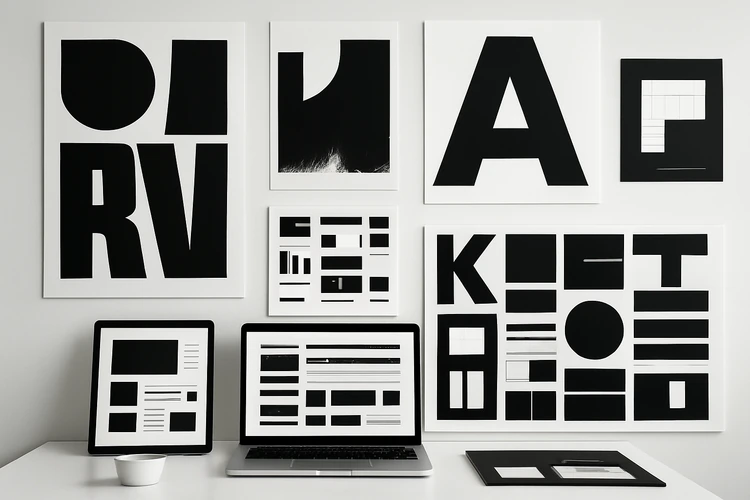
The risk is that brutalist typography can become aggressive or difficult to read. It should be used with discipline. A brand may use a brutalist display face for headlines while relying on a cleaner companion typeface for body copy, product UI, and long-form content.
High-Contrast Serifs in Tech and Fashion
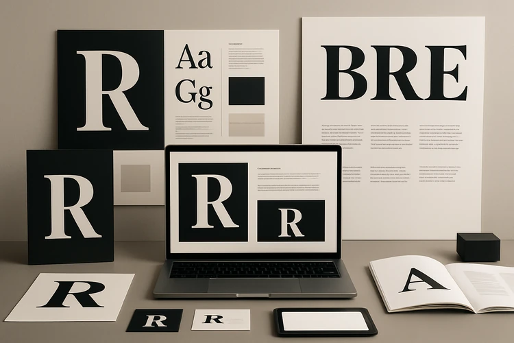
High-contrast serif typefaces are also returning, especially in premium technology, fashion, beauty, editorial, and lifestyle branding. These fonts have thin and thick stroke contrast, elegant curves, and a more refined personality. They bring sophistication to digital environments that were once dominated by neutral sans-serif fonts.
For tech brands, a high-contrast serif can create warmth and authority. It can make an AI platform, productivity tool, or fintech product feel more editorial, thoughtful, or premium. For fashion and beauty brands, it reinforces elegance, taste, and heritage.
High-contrast serifs are often used for:
- Hero headlines
- Campaign titles
- Editorial landing pages
- Luxury product names
- Brand manifestos
- Packaging headlines
- Magazine-style digital experiences
- Premium presentation decks
This trend shows that modern digital branding is becoming more expressive. Companies want to feel less like software templates and more like media brands with a point of view.
Variable Fonts and Responsive Flexibility
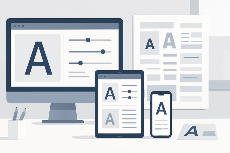
Variable fonts are one of the most important technical shifts in typography. A variable font allows multiple styles, weights, widths, or optical sizes to exist inside a single font file. Instead of loading many separate font files, designers and developers can adjust typographic properties more fluidly.
This is especially valuable for responsive web design. A headline may need to be wide and bold on desktop but narrower on mobile. A UI label may need slightly different weight in dark mode. A brand may want animated transitions between font weights or widths. Variable fonts make these systems more flexible.
Variable fonts can help brands with:
- Responsive headline systems
- Performance-conscious web typography
- Flexible design systems
- Motion and interaction effects
- Better control across screen sizes
- Fewer separate font files
- More expressive digital identity
The challenge is implementation. Designers need to work with developers to define rules for weight, width, scale, and motion. Without documentation, variable fonts can become inconsistent.
Expressive Sans-Serifs With Personality
Neutral sans-serif fonts are not disappearing, but brands are moving away from completely anonymous choices. Modern sans-serifs increasingly include subtle personality: unusual terminals, softer geometry, tighter rhythm, sharper cuts, or slightly humanist proportions. These details make the font feel ownable while still maintaining readability.
This is especially useful for SaaS, B2B, fintech, health tech, productivity tools, and agencies that need clarity but do not want to look generic. A brand can still feel modern and professional without using the same neutral typeface as everyone else.
Expressive sans-serifs work well when they:
- Stay readable at small sizes
- Support multiple weights
- Include strong punctuation and numerals
- Work in UI and marketing contexts
- Have enough personality for headlines
- Avoid gimmicks that age quickly
A good modern sans-serif does not shout. It gives the brand a recognizable accent.
Condensed Type for Stronger Visual Impact
Condensed typography is becoming more popular in digital campaigns, posters, packaging, and editorial websites. Condensed typefaces use narrow letterforms, allowing designers to create large headlines in limited space. They feel bold, efficient, and visually dense.
Condensed type is useful when brands want high impact without long horizontal layouts. It works well in hero sections, social graphics, event branding, sports brands, streetwear, music campaigns, and editorial covers.
Use condensed type carefully in long phrases. Narrow letterforms can become hard to read when the text is small, tightly spaced, or used in paragraphs. It is best for short headlines, labels, and campaign moments.
Editorial Typography for Digital Brands
Many modern brands are borrowing from magazine and editorial design. They use large headlines, generous whitespace, serif and sans-serif pairings, pull quotes, captions, structured essays, and strong typographic rhythm. This is especially visible in premium SaaS, AI companies, founder-led brands, cultural platforms, and design-forward startups.
Editorial typography makes digital brands feel more thoughtful and authoritative. It also supports content-heavy marketing, where brands need to publish essays, reports, guides, interviews, and thought leadership pieces.
Editorial typography often includes:
- Large expressive headlines
- Clear article hierarchy
- Strong intro paragraphs
- Pull quotes or highlighted statements
- Elegant captions
- Narrow readable text columns
- Serif and sans-serif contrast
- Better spacing between content sections
This approach helps brands communicate depth. It tells the reader that the brand has something to say, not just something to sell.
Monospace Fonts for Technical Credibility
Monospace typography remains popular in developer tools, AI products, cybersecurity, data platforms, fintech dashboards, and technical brands. Because every character occupies the same width, monospace fonts are associated with code, systems, precision, and engineering culture.
But the trend has evolved. Brands are no longer using monospace only for code snippets. They use it for labels, captions, navigation, badges, metadata, and brand accents. A small amount of monospace can make a visual identity feel more technical without overwhelming the whole design.
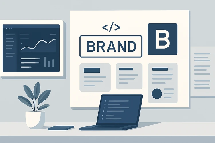
The best use of monospace is selective. Too much monospace can feel cold or hard to read. It works better as a layer of technical texture paired with a more comfortable primary typeface.
Custom Typefaces and Modified Wordmarks
Custom typography is becoming more attractive to brands that want stronger ownership. A fully custom typeface can be expensive, but brands do not always need a complete font family. Sometimes a modified wordmark, custom headline style, or adjusted letterforms can make the identity feel more proprietary.
A custom typographic detail can create recognition even when the rest of the design system is simple. This is important for brands that operate across many channels and need a recognizable core asset.
Custom typography can include:
- Modified logo letterforms
- Custom headline typeface
- Unique numerals
- Brand-specific ligatures
- Custom punctuation or icons
- A proprietary display font
- Adjusted spacing and optical corrections
For smaller brands, modifying a wordmark may be more practical than commissioning a full type family. The goal is not complexity. The goal is ownability.
Pairing Display Fonts With Functional Systems
A common modern approach is to use expressive typography for brand moments and functional typography for everything else. This creates personality without sacrificing usability. The display typeface carries emotion. The supporting typeface handles navigation, body copy, UI, forms, captions, and documentation.
This pairing strategy is useful because most brands need both expression and performance. A fashion brand may use a dramatic serif headline but a clean sans-serif for product details. A SaaS brand may use a distinctive display font in hero sections but a highly readable sans-serif inside the product.
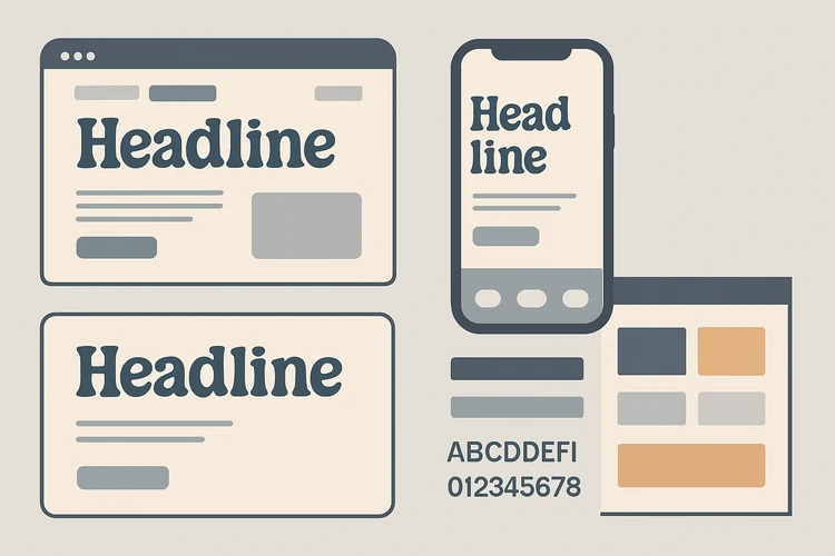
A practical type pairing should define:
- Primary headline font
- Secondary headline style
- Body copy font
- UI font
- Caption and metadata style
- Numeric style
- Mobile adjustments
- Accessibility rules
Without these rules, a trendy font pairing can quickly become messy.
Typography in Motion and Interactive Branding
Typography is increasingly animated. Brands use moving letters in hero sections, loading screens, social videos, product demos, and campaign content. Motion can make typography feel dynamic and memorable, especially for digital-first brands.
Motion typography can include:
- Variable font weight transitions
- Text reveal animations
- Kinetic headlines
- Scrolling marquees
- Interactive hover typography
- Animated counters
- Loading wordmarks
- Campaign title sequences
Motion should support meaning. A fast-moving type animation may work for a music platform or creative studio but feel inappropriate for a healthcare or finance brand. The movement should match the brand personality.
Accessibility and Readability Still Matter
Trends should never override readability. A typeface may look impressive in a large mockup but fail in real use. Users read on different devices, screen qualities, lighting conditions, and connection speeds. A brand type system must work beyond the perfect presentation slide.
Readability problems often come from:
- Thin strokes on low-quality screens
- Poor contrast
- Overly tight letter spacing
- Decorative fonts in long copy
- Small mobile text
- Weak numeral readability
- All-caps paragraphs
- Poor line height
- Slow-loading web fonts
A modern brand should test typography in real contexts: mobile screens, forms, dashboards, long articles, email templates, print, and social graphics. Typography is not finished until it works where the audience actually sees it.
How Brands Should Choose a Typography Direction
Choosing a typography trend should begin with positioning, not taste. A brutalist typeface may look exciting, but it may not fit a financial advisory brand. A high-contrast serif may feel elegant, but it may not work for a dense product dashboard. A variable font may be powerful, but only if the team can implement it properly.
Before choosing a type direction, ask:
- What personality should the brand communicate?
- Where will the typography appear most often?
- Does the typeface work on mobile?
- Is it readable in long-form content?
- Does it support the needed languages?
- Are the numerals strong enough for data or pricing?
- Does the license fit commercial use?
- Can the development team implement it efficiently?
- Will this still feel relevant in three years?

The right typeface is not always the most fashionable one. It is the one that makes the brand clearer, more memorable, and easier to use.
Final Thoughts
Typography is becoming one of the most important tools for modern brand differentiation. Bold brutalist typefaces help brands feel disruptive. High-contrast serifs bring elegance and editorial authority. Variable fonts give digital systems flexibility. Expressive sans-serifs, condensed type, monospace accents, custom wordmarks, and motion typography all give brands more ways to stand out.
But trends only work when they are connected to strategy. Typography should express the brand’s personality, support readability, scale across channels, and remain practical for real production. The most successful brands are not simply choosing fashionable fonts. They are building typographic systems that make every message feel more distinctive, more intentional, and more recognizable.