
Modern digital interfaces are no longer expected to sit still. Users expect feedback when they click, tap, scroll, submit, drag, save, refresh, swipe, or complete an action. These small moments are called micro-interactions. They may look subtle, but they have a major effect on how an interface feels and how clearly users understand what is happening.
A micro-interaction can be as simple as a button changing state on hover, a form field showing validation, a loading indicator confirming progress, or a small animation after a successful action. These details make products feel responsive, human, and easier to use. In web and app design, micro-interactions are becoming less of a luxury and more of a usability expectation.

What Micro-Interactions Actually Are
Micro-interactions are small design responses triggered by a user action or system change. They usually focus on one tiny task: confirming, guiding, warning, rewarding, or providing feedback. They are not full animations or major page transitions. They are the small details that help the user understand the interface.
Common micro-interactions include:
- Button hover and press states
- Form validation messages
- Toggle switches
- Loading spinners or progress bars
- Pull-to-refresh feedback
- Swipe confirmations
- Save or success animations
- Notification badges
- Password strength indicators
- Like, favorite, or reaction animations
The best micro-interactions are useful before they are decorative. They answer a simple question: what just happened?
Why Static Interfaces Feel Outdated
Static interfaces can feel cold and uncertain. If a user clicks a button and nothing visibly changes, they may wonder whether the click worked. If a form is submitted without feedback, they may submit it again. If an app is loading without indication, the user may assume it is broken.
Micro-interactions reduce uncertainty. They make the interface feel responsive. This is especially important because users now compare every digital experience to the smoothest apps they use daily. A slow or unresponsive interface can make even a visually beautiful product feel unfinished.
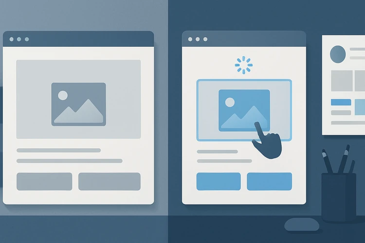
Static interfaces often fail to communicate:
- Whether an action was registered
- Whether a process is loading
- Whether input was valid
- Whether a change was saved
- Whether an error occurred
- What the user should do next
Micro-interactions fill those gaps.
The Four Jobs of a Micro-Interaction
A strong micro-interaction usually performs at least one of four jobs: feedback, guidance, prevention, or emotional reinforcement. Understanding these jobs helps designers avoid adding motion just because it looks trendy.
Feedback tells the user that something happened. Guidance helps the user understand the next step. Prevention stops errors before they become bigger problems. Emotional reinforcement makes the experience feel satisfying and complete.
Examples include:
- Feedback: a button changes after being clicked
- Guidance: a field highlights where input is needed
- Prevention: password rules update as the user types
- Emotional reinforcement: a small success animation after completing a task
A micro-interaction should have a reason. If the reason is only “because it looks cool,” it may become noise.
Micro-Interactions and Trust
Trust in digital products is built through predictability. Users want to know that the system understands their actions. Micro-interactions help build that trust by making invisible processes visible. When a payment is processing, a file is uploading, or a form is saving, feedback is not optional. It is reassurance.
For business-critical interfaces, micro-interactions can reduce anxiety. A user submitting financial information, booking an appointment, updating a profile, or sending a proposal needs confirmation that the system worked.
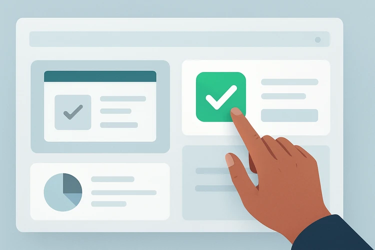
Trust-building micro-interactions include:
- Save confirmations
- Payment processing indicators
- Upload progress bars
- Error recovery messages
- Undo options
- Success states
- Secure action confirmations
Small details can prevent large support problems.
Motion Should Support Meaning
Micro-interactions often involve motion, but motion must be controlled. Too much motion can distract, slow the interface, or create accessibility problems. The best motion is fast, subtle, and connected to meaning.
Motion can communicate:
- Direction
- State change
- Cause and effect
- Progress
- Completion
- Relationship between elements
- Hierarchy and focus
For example, a dropdown that opens from the button helps users understand where it came from. A card that slides into place after being added to a list confirms the action. A field that gently shakes after invalid input signals that something needs correction.
Good motion feels natural. Bad motion feels like decoration interrupting the task.
Designing Better Button States
Buttons are one of the most common places for micro-interactions. A button should not look the same in every state. Users need to understand when it is available, hovered, pressed, loading, disabled, or completed.
Button states should include:
- Default
- Hover
- Focus
- Active or pressed
- Disabled
- Loading
- Success
- Error when relevant
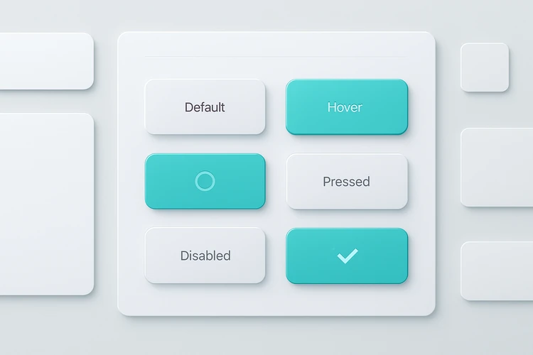
A button that shows loading after click prevents duplicate submissions. A disabled button with clear explanation prevents confusion. A success state reassures the user that the task was completed.
Forms and Validation Feedback
Forms are where micro-interactions can dramatically improve usability. A form without clear feedback can become frustrating. Users need to know what is required, what is valid, what failed, and how to fix it.
Good form micro-interactions include:
- Real-time validation
- Helpful error messages
- Input formatting
- Password strength indicators
- Field focus states
- Character counters
- Success confirmation
- Progress indicators for multi-step forms
The most important principle is kindness. Error messages should explain what to do, not blame the user. Instead of “Invalid input,” a better message says, “Please enter the date in this format: DD/MM/YYYY.”
Micro-Interactions in Mobile Apps
Mobile interfaces rely heavily on micro-interactions because screen space is limited. Gestures, taps, swipes, haptics, and small transitions help users understand navigation and action. On mobile, feedback must be immediate because the user’s finger often hides the interface during interaction.
Useful mobile micro-interactions include:
- Tap ripple or press feedback
- Pull-to-refresh animation
- Swipe-to-delete confirmation
- Bottom sheet transitions
- Haptic response for important actions
- Drag-and-drop feedback
- Loading skeletons
- App navigation transitions

Mobile micro-interactions must be fast. Long animations can make the app feel slow even when the design looks polished.
Performance and Accessibility
Micro-interactions should not damage performance. A beautiful animation that slows loading, drains battery, or causes layout shifts can harm the user experience. Designers should work with developers to ensure interactions are lightweight.
Accessibility also matters. Some users are sensitive to motion. Interfaces should respect reduced-motion preferences where possible. Important information should never be communicated only through animation.
Accessible micro-interactions should:
- Respect reduced-motion settings
- Avoid flashing or intense movement
- Pair motion with text or icon feedback
- Keep focus states visible
- Avoid relying only on color changes
- Maintain keyboard accessibility
- Stay fast and predictable
The goal is to make the interface clearer for everyone, not only more animated.
Building Micro-Interactions Into a Design System
Micro-interactions should be part of the design system, not random decorations added screen by screen. If every designer creates different hover states, loading indicators, and success animations, the product will feel inconsistent.
A design system should define:
- Component states
- Animation duration
- Easing rules
- Loading patterns
- Success and error feedback
- Form validation behavior
- Motion accessibility rules
- Interaction documentation for developers
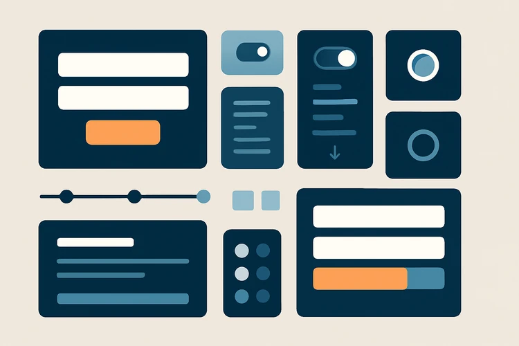
This makes the product feel coherent and makes development easier.
When Micro-Interactions Become Too Much
Micro-interactions can be overused. If every element bounces, glows, slides, shakes, and celebrates, users become distracted. The interface starts performing instead of helping. This is especially risky in professional tools, dashboards, finance apps, healthcare products, and productivity software.
Avoid micro-interactions that:
- Delay the user’s task
- Add motion without meaning
- Compete with important content
- Feel childish for the product context
- Repeat too often
- Hide slow performance
- Make the interface harder to scan
Micro-interactions should serve the task, not the designer’s desire to show motion skill.
Final Thoughts
Micro-interactions are rising because users expect interfaces to respond clearly and immediately. They are small, but their impact is large. They help users understand actions, trust the system, avoid errors, and feel that the product is polished.
The best micro-interactions are not flashy. They are useful, consistent, accessible, and aligned with product meaning. As static interfaces become less acceptable, designers who master these small details will create products that feel smoother, clearer, and more human.